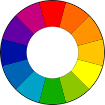
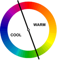
Colour SchemesPhotography is made up of certain elements and guidelines. But an important thing in any photo, is of course colour. Below is a photo of the colour wheel, which I'll be using to explain things. The colour wheel dates back to 1666. Three primary colours, which are Blue, Red and Yellow. Every other colour out there are created by mixing these three colours together. Primary colours mixed together creates Secondary colours (Orange/Purple/Green) and when those are mixed together, they create Tertiary colours. Warm vs Cool: Warm colour tones range from red to yellow and create a sense of warmth or heat in an image. Cool colour tones are usually mostly blues and gives an impression of coldness.
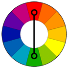
Complimentary Colours
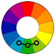
Analogous Colours
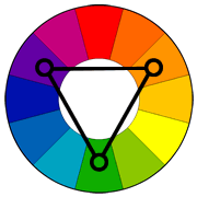
Triadic Colours
Monochromatic ColoursA monochromatic scene consists of varying shades of a single color. The key to a successful monochromatic image is to find scenes with good contrast throughout the image--you want the photo to have a dark version of the color, a light one and a good range of tones in between. ConlusionComplementary, Analogous and Triadic are the three main colour schemes. They are very useful in photography, but really in any art form. Colour influences the mood of an image and can make objects or points of interest stand out. However, be careful. When used incorrectly, they can ruin an image.
0 Comments
Leave a Reply. |
AuthorPhotographer & animal lover with a barn full of rabbits and a cat. Archives
January 2021
Categories |
 RSS Feed
